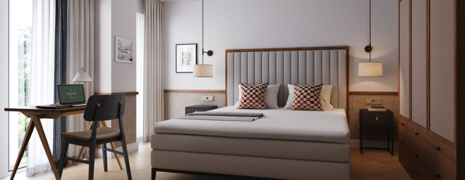
Branding harmonising with interiors
The branding of Sophia Lane Suites Amsterdam was inspired by the image of a flower. With Vondelpark a stones throw away, the petals and natural references feel at home inside the development.

Door Signage that speaks to the Logo design
Using one of the ‘petals’ taken from the main branding flower graphic, the door signage and numbering cleverly follows through the same design language.
Main Logo adapts to a variety of applications
Gold is a key colour used within this luxurious apartment development, the logo follows the same palette, whereas the bespoke font is crafted to reflect the contemporary architecture.


Sophistication & Effortless Elegance
With a striking design, this graphic can be applied in numerous ways, from signage, letter templates, room key cards and more.
Marketing Brochure that ties together all elements
FIG aims to support every facet of a project. For Sophia Lane Suites we have created a marketing brochure, ensuring the lasting sucess of both the interiors for its end users, and global interest as an investment.


