A major refurbishment of the brands flagship property
Situated in the heart of the famous street the Ramblas, the design for the Citadines Flagship Barcelona takes it’s inspiration literally from the streets of the city.
The paving of much of the city is made from a hexagon concrete tile that was designed by Gaudi himself. We took this pattern as well as the mosaic concept started by Gaudu, which is all over the city.
The building was designed by a famous architect and stands out as a contemporary work of art in between more traditional Spanish style buildings. Our design of the interior was also contemporary with traditional touches.


Slick refresh of entrance & lobby
We totally re-allocated the entrance of the hotel from the front on the main street to the side of the property down an alley way that was rarely used!
This was a challenge but with good desig, good lighting and good signage, it became a very good alternative to enable the retail to take over on the street front. Our lift lobby design featured a standing lamp and key pieces to emphasis the entrance. We commissioned photographer Frederic Ducout to take photos of the Ramblas which we then displayed on the entrance stairs.

Scenes of the city
In the corridors we used old photographs that had been in the archives of the hotel. We enlarged them and cropped them, transferred them into sepia tones and hung them on the corridor walls against a soft tan colour. The ceiling and doors are black, an elegant contrast to the walls. The hexagon concept was also used in the carpet in front of each hotel room door, as a contrast inset.
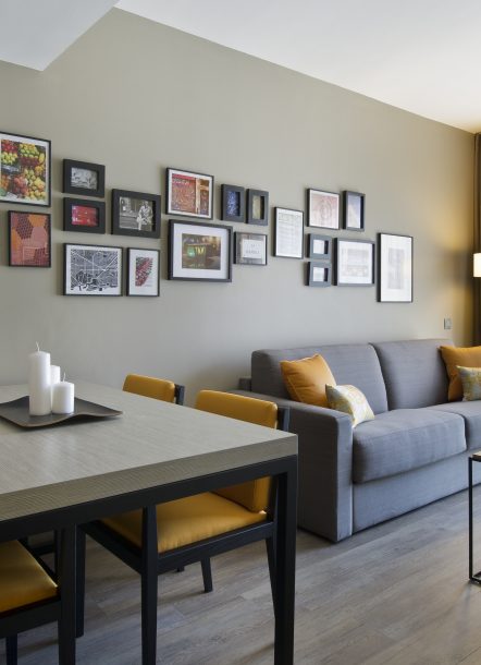
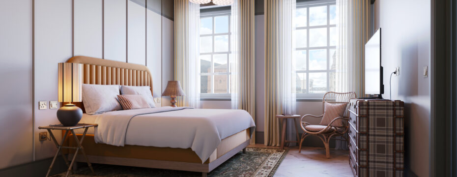
In the rooms the colour palette remained soft and neutral and the colour was brought out in the mosaic style artwork. Every artwork was selected by FIG.

The Spirit of Barcelona
The spirit of the this City in particular is very vibrant and colourful. We brought this element into the artwork and the accent colour is a bold yellow, one that particularly worked with the soft green/grey backdrop. The black accents are also very ‘Barcelona’ – if you ever notice that black is everywhere in design in this city – you can understand why it works so well in this design.

Clever space saving re-layouts
We re-worked the bathroom and kitchen to create a larger space for both areas, just by moving a few walls the space was transformed from boxy to open. We replaced the backsplash on the kitchen walls and replaced all of the laminate to create a fresh modern look. We designed the casegoods and had them made with one of our Spanish suppliers.


